We were recently involved in helping a customer build an stock watchlist Excel spreadsheet based around the Large Cap watchlist on the Yahoo Finance website.
They wanted it to “look good” so here are some techniques we used to improve formatting and visualisations:
Custom number format colours
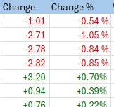
One useful Excel feature for financial spreadsheets is the ability to change the colour of a number depending on whether the number is positive or negative. Usually this is used to show negative numbers as red and positive as black, like this:
You can see that the negative colour, red, is specified in [] brackets; the semi-colon separates the positive and negative formatting (black is the default colour).
What if we want to show a positive change in green, such as an increase in a stock price? Well, Excel has 8 built in colours:
[Black][Green][White][Blue][Magenta][Yellow][Cyan][Red]
Let’s try green, with this formatting: [Green]0.00 ;[Red]-0.00
Ugh, it’s a horrible luminous green!
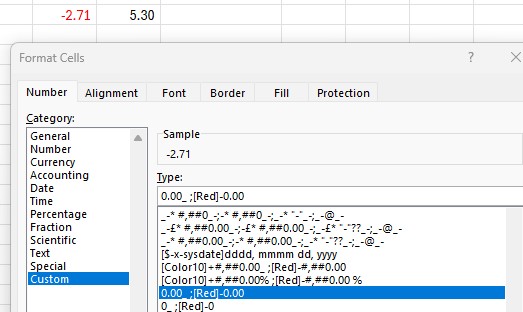
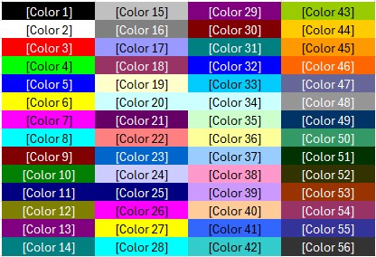
Fortunately there are 56 colours that we can choose from, although these are not well documented by Microsoft and require a colour code rather than a name:
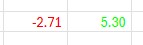
Let’s try Colour10 instead, and we’ll also add a + symbol to signify a positive change: [Color10]+0.00 ;[Red]-0.00
That looks much better!
Data Bars
Data bars are a very simple but effective visualisation technique in Excel to easily show comparisons between numbers.
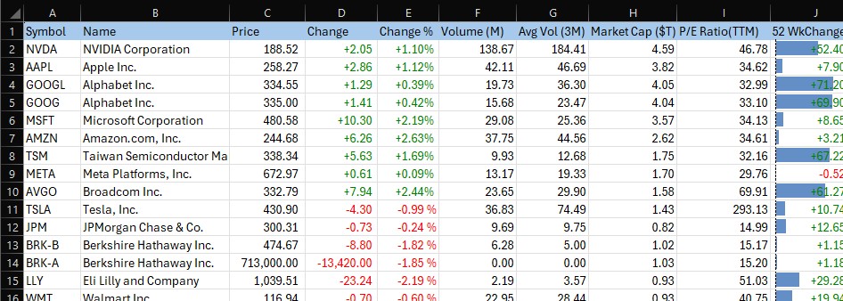
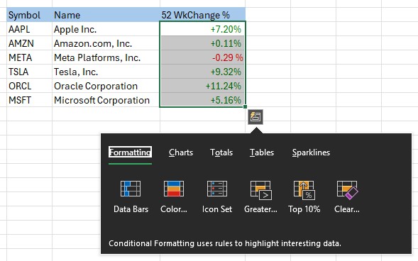
Here we are showing the 52 week percentage change in a stock price for a bunch of stocks:
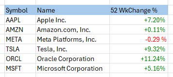
We would like to add a Data Bar so that a quick visual comparison can be made.
First, we highlight the cells, a small icon appears at the bottom right of the selection, we can then see the various visualisation options:
Select “Data Bars”, and the result is horizontal bars which provide a great way to quickly compare values:
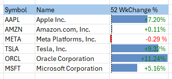
There are other visualations, known in Excel as “Conditional Formatting” such as Color Scales and Icon Sets which can be used to create similar visualisations.
We hope you find these tips useful.
You can download the Large Cap spreadsheet here: https://coderun.blob.core.windows.net/epf/samples/YahooLargeCapStocks.xlsx
It includes Excel Price Feed formulas to retrieve live stock data, so each time you refresh the spreadsheet the values are updated: