Chart Crime and Bubbles

There are lies, damned lies and statistics. There are also charts that are published to mislead or to simply reinforce a point of view that’s flimsy at best or just plain wrong.

These charts are known as “chart crimes” and one appeared all over social media last month. Usually I would just make a comment and move on but this one received over 2 million views and deserves further investigation.

It was a chart comparing the growth of the Nasdaq over two periods: the dot com bubble and the current AI “bubble”. The conclusion being that we are on the same upward trajectory and all things being equal are due a major crash anytime soon.

Here is the chart and tweet in question:

AI Boom vs. Dot Com Bubble.

Aside from the obvious lack of timescale on the x axis and disparity in y axis scaling, does this chart bear any resemblance to reality?

Let’s build our own using Excel Price Feed to retrieve historical market data and produce an Excel chart based on the actual data.

For the Dot com bubble period we will use 1996 to 2002 and for present day we will look at data from Q4 2022 (when ChatGPT was released) to now.

To retrieve the data we will use the Excel Price Feed HistoricDatePeriod formula. Here is an example of how to retrieve monthly data for the NASDAQ Composite Index:

=EPF.Yahoo.HistoricDatePeriod("^IXIC","MONTHLY","1 Sep 2022","1 Oct 2025","ASC",1)

We will base each time series to 1 so we are comparing like-for-like. To do this we simply divide each point by the initial starting point.

We can now plot this data in Excel; the blue line is the dot com bubble, and the orange line is the past 3 years:

Compare Nasdaq dotcom bubble vs AI bubble

Not nearly as dramatic, the trajectory is similar but we are barely halfway towards the dot-com crash equivalent peak. So if the past is an indicator of the future then we should expect the market to double again from here and crash in about a year. But as they say, the past is not always a predictor of the future…

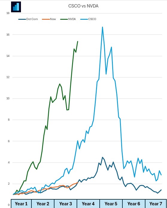
What about individual stocks?

Let’s look at one from the dot com bubble: Cisco (light blue) and one from now: Nvidia (green).

Nvidia has climbed at a much steeper rate than Cisco. Again, similar trajectory and timescales:

Compare CSCO dot com bubble with NVDA stock now

If you want to build financial charts like this yourself check out Excel Price Feed today and try it free for 10 days: https://www.excelpricefeed.com/

Are we in an AI fueled stock market bubble?

AI (Artifical Intelligence) chip on a circuit board

AI is everywhere now; not a day goes by without at least one company releasing an AI related news announcement, the latest being Volkswagen who are integrating ChatGPT into their next generation of cars.

These AI announcements are usually accompanied by a spike in the company’s stock price and this, together with the recent rise in the tech and broader market, has prompted some market commentators to declare that we are in an AI fueled stock market bubble.

Are we in a bubble?

Unfortunately, we will only know if and when the bubble bursts; by its very definition we cannot know if we are in a bubble but let’s crunch some numbers to investigate further.

We’ll use Excel Price Feed to get some financial data into Excel, and we’ll start by looking at the “Magnificent Seven”.

What are the Magnificent Seven? Well, these are the largest, most significant players in the global tech industry, and are leading the charge in bringing AI to the masses:

  • Apple
  • Microsoft
  • Alphabet
  • Amazon
  • Nvidia
  • Meta
  • Tesla

We’ll start with market capitalization, and use the Excel Price Feed formula EPF.Yahoo.MarketCap together with a nice stacked chart to see how they stack up (excuse the pun), units are $trillion:

Magnificent Seven Market Capitalization as of January 2024

The total market capitalization of these 7 companies is almost $12 trillion, but how does this compare to the market in general, say the S&P500?

Here we have added the rest of the S&P500 ($27 trillion) and can see that the Magnificent Seven account for more than one quarter of the entire market:

Magnificent Seven stocks market capitalization versus the S&P500

What is even more astounding is how these 7 stack up against entire stock exchanges.

Here we are comparing them with the 3 largest non-US exchanges: Shanghai, Euronext and Japan:

Magnificent Seven market capitalization versus Shanghai, Japan and Euronext stock markets

Now let’s see how they have grown over the last 12 months.

We’ll use the EPF.Yahoo.Historic.Close formula to retrieve the stock price at the start of 2023 and compare it to the current stock price using EPF.Yahoo.Price

Magnificent 7 stocks one year price change chart for 2023

They’ve all increased by at least 50%, with Nvidia, perhaps the most AI centric stock being the star performer.

So, are we in a bubble?

Why not download Excel Price Feed today and crunch some numbers yourself. You can also download the spreadsheet created for this post from our website to get started.