We have just released a new version of Excel Price Feed, and this release includes a bunch of new Excel formulas to help with date/time manipulation in Excel.
New “Now” Formulas
The first set of new formulas are replacements for the built-in Excel “volatile” formulas NOW and TODAY.
We’ve talked about volatile Excel formulas on this blog before, the key takeaway being to avoid them at all costs. Unfortunately this is easier said than done as there is no built-in Excel alternative, until now…
Introducing EPF.Dates.Now.Local, a non volatile Excel formula which returns the local date/time on your PC.
In addition, there is now EPF.Dates.Now.UTC which returns the current UTC (Coordinated Universal Time) date/time.
We’ve also created formulas to return the current date/time in a bunch of different time zones:
EPF.Dates.Now.ESTfor US Eastern Standard Time, the time zone for New York.EPF.Dates.Now.GMTfor GMT Standard Time, the time zone for London.EPF.Dates.Now.CETfor Central Europe Standard Time, the time zone for Paris and Frankfurt.EPF.Dates.Now.JSTfor Japan Standard Time, the time zone for Tokyo.EPF.Dates.Now.AESTfor Australian Eastern Standard Time, the time zone for Sydney.
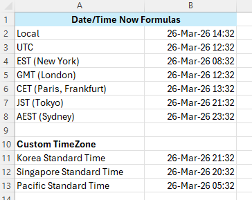
There is also an additional formula, EPF.Dates.Now.TimeZone, in order to convert a UTC date/time into any other time zone from this list: https://www.excelpricefeed.com/userguide/date-time-formulas#timezones
New Date/Time Conversion Formulas
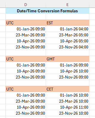
Converting dates and times between time zones in Excel is not easy. There are no built in conversion formulas in Excel and many of the workarounds you see online are either very complicated string manipulation formulas, or simpler formulas but don’t take into account daylight savings time etc.
We have therefore released a bunch of simple-to-use Excel formulas that convert between time zones taking into account daylight savings time. Like the new Now formulas they cover major time zones:
EPF.Dates.UTC.To.LocalEPF.Dates.UTC.To.ESTEPF.Dates.UTC.To.GMTEPF.Dates.UTC.To.CETEPF.Dates.UTC.To.JSTEPF.Dates.UTC.To.AESTEPF.Dates.UTC.To.TimeZone
Here we can see them in action on our sample spreadsheet:
We hope you find these new formulas useful and let us know if there are other date/time related formulas that you would like us to add to the Add-in.