If you’ve ever seen a headline such as “Nvidia stock rises after 10-for-1 stock split” and wondered whether that’s actually a big deal, you’re not alone. Stock splits sound technical but the idea behind them is surprisingly simple and they can matter more to investors than they first appear.
What Is a Stock Split?
A stock split happens when a company changes the number of shares outstanding by either dividing or multiplying its existing shares, without changing the overall value of the company.
Think of it like breaking a $100 bill into two $50 bills. You still have $100; it’s just divided into smaller pieces!
Here’s an example:
- Before the split: You own 1 share priced at $200
- After a 2-for-1 split: You own 2 shares, each priced at $100
- Your total investment value stays the same: $200 before, $200 after
Nothing magical happened to the company’s fundamentals. revenue, profits, and market capitalization don’t change just because of a split.
Why Do Companies Split Their Stock?
To Make Shares More Affordable
A high stock price can be intimidating to everyday investors. While fractional shares exist many investors still prefer whole shares. By lowering the price per share, a company:
- Attracts more retail investors
- Increases accessibility
- Makes trading feel more approachable
To Improve Liquidity
Lower share prices often lead to:
- More trading activity
- Tighter bid-ask spreads
- Easier entry and exit for investors
As a Signal of Confidence
Companies usually split their stock after strong price appreciation. Management doesn’t do this randomly; it often reflects confidence in continued growth. While a split itself doesn’t create value, it can reinforce the idea that:
- The company is doing well
- Leadership expects the business to keep performing
Why Stock Splits Matter to Investors
From a purely financial perspective nothing changes. But in the real-world lower prices feel “cheaper”, more investors get involved and therefore demand can increase Markets are driven by people, not just spreadsheets!
Some indexes and funds weigh stocks by price or have practical constraints. A lower share price can make inclusion easier and therefore increase exposure to the stock through ETFs and mutual funds. That can mean more automatic buying over time and potentially an appreciating stock price.
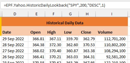
Using Excel to Analyze Stock Splits
The Excel Price Feed Add-in includes 3 new Excel formulas for retrieving stock split data:
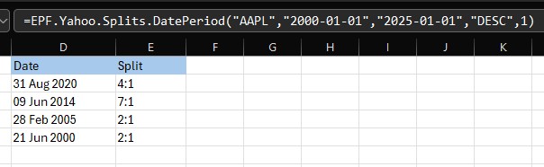
EPF.Yahoo.Splits.DatePeriod
This Excel formula retrieves a time series of stock splits for the specified ticker and date period.
The example spreadsheet and formula below shows Apple stock (AAPL) splits since 2000:
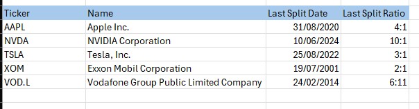
EPF.Yahoo.Splits.LastDate
This Excel formula retrieves the last date there was a stock split event for the specified ticker.
EPF.Yahoo.Splits.LastRatio
This Excel formula retrieves the last stock split ratio event for the specified ticker.
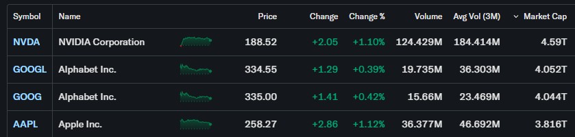
The example spreadsheet below shows a bunch of stocks and their last split date and ratio using these formulas:
We hope you find these new Excel formulas useful.